Case Studies
Neko

Overview
THE CHALLENGE
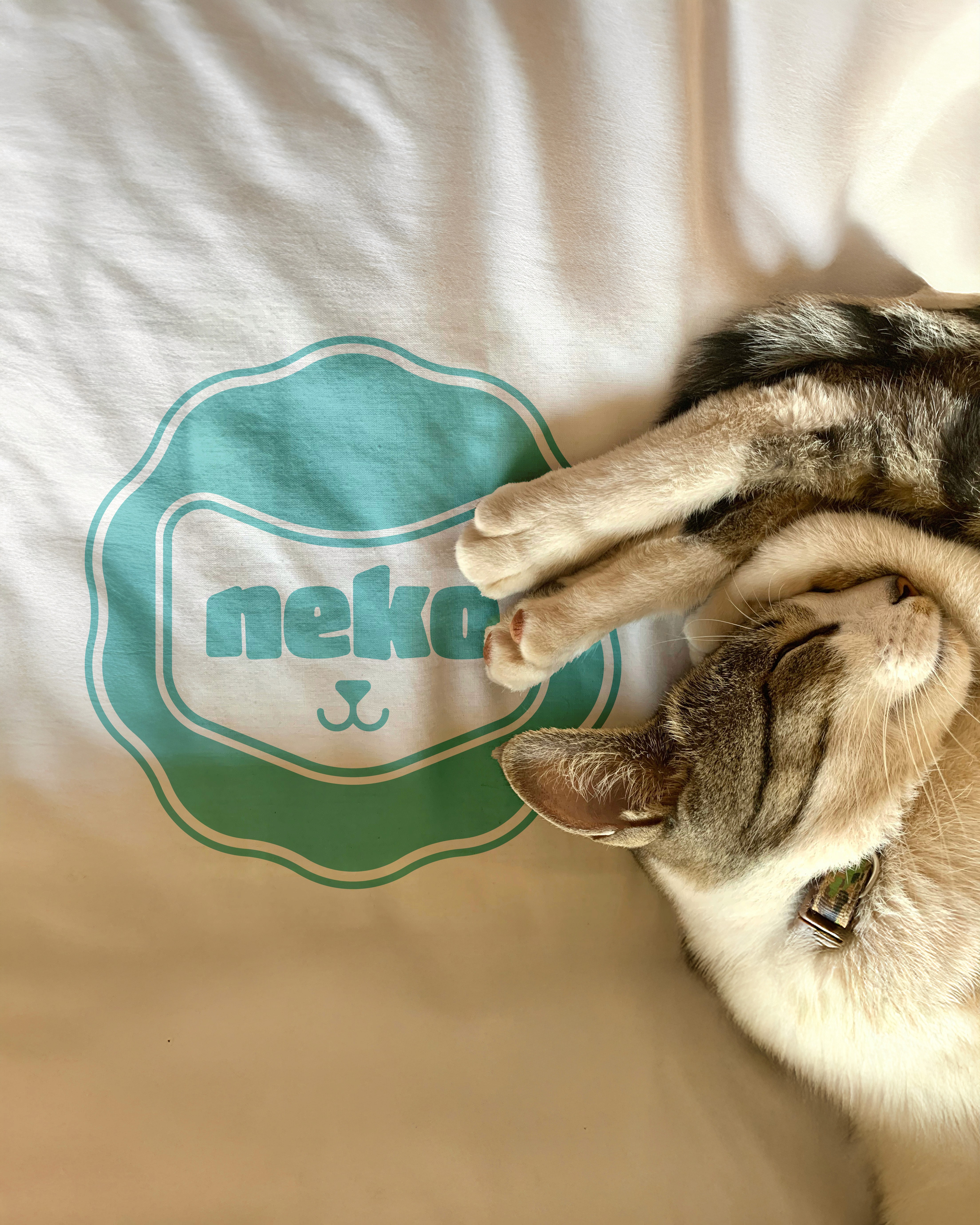
Pet care branding often leans into generic paw motifs or sterile aesthetics. Neko needed a warm, friendly identity designed specifically for modern cat parents.
THE STRATEGIC APPROACH
We merged dual exchange arrows into a subtle cat silhouette—symbolizing seamless product delivery and satisfaction, paired with soft, custom-angled letterforms for visual harmony.
THE IMPACT
The identity establishes Neko as an approachable, pet-first brand with a distinct graphic language optimized for e-commerce, packaging seals, and digital platforms.